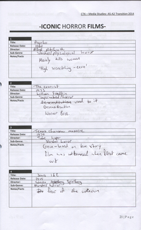
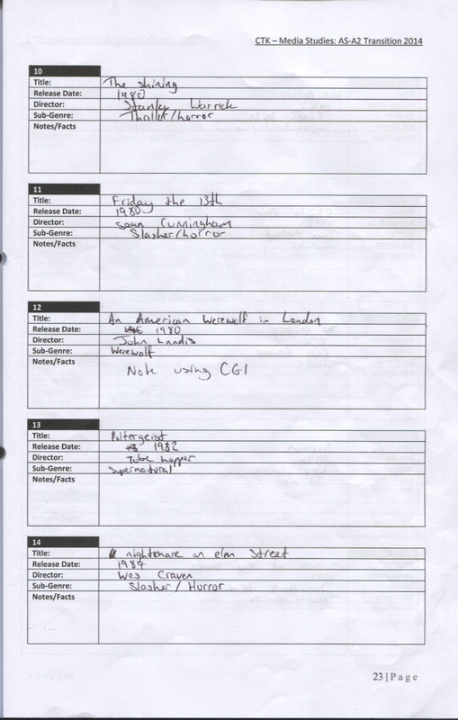
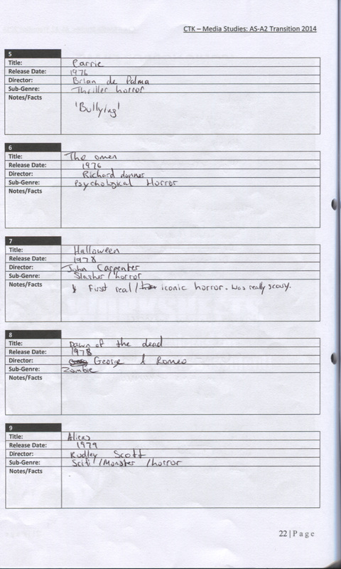
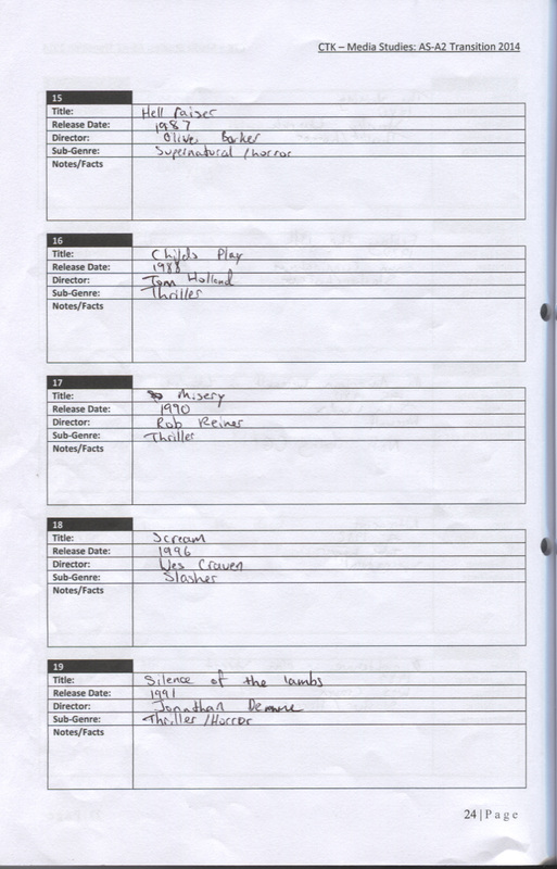
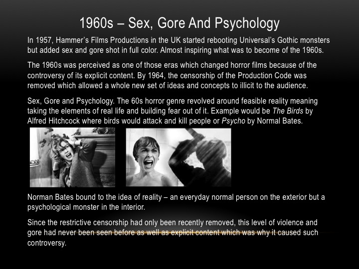
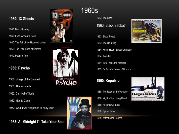
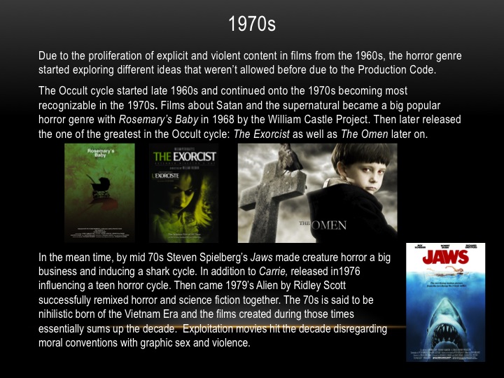
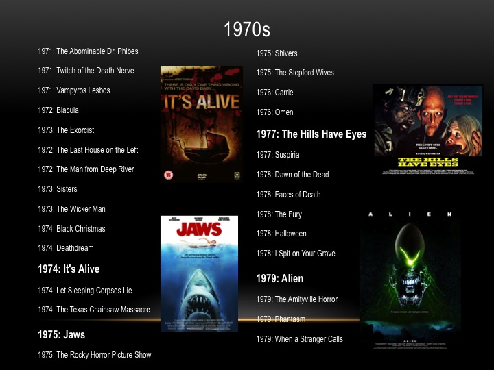
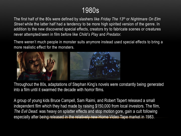
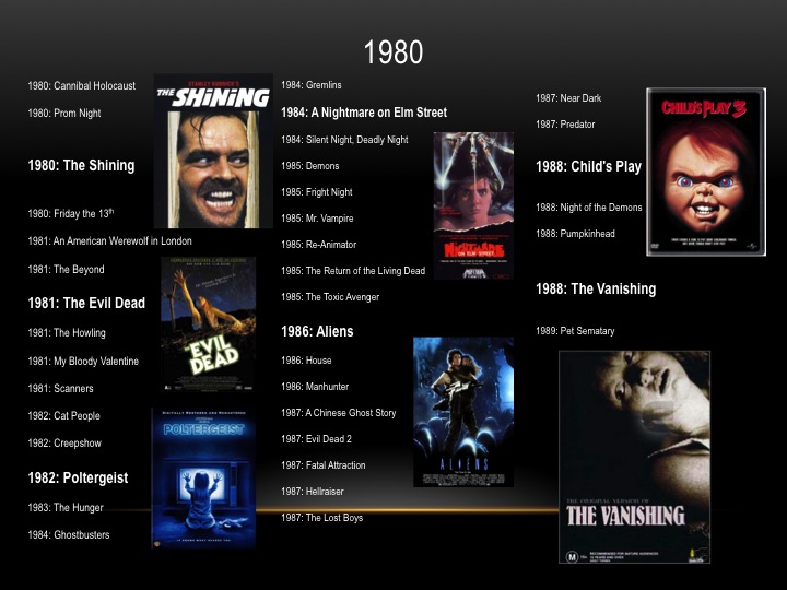
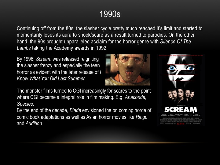
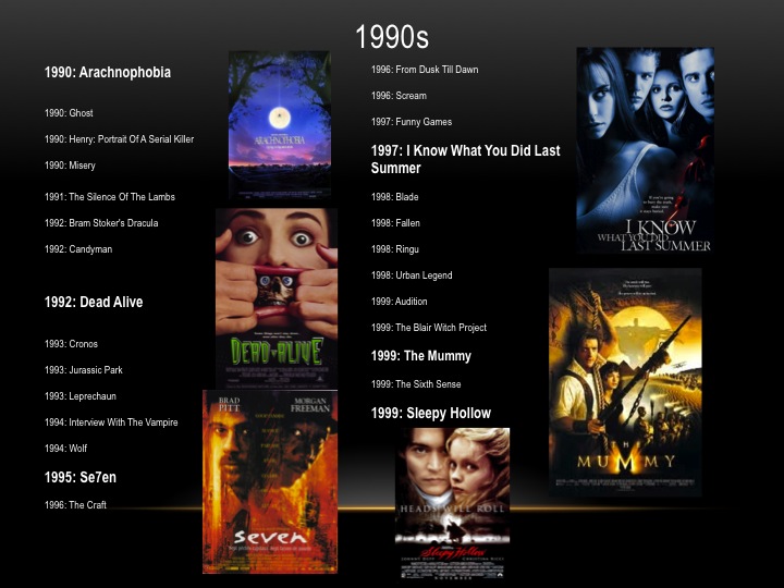
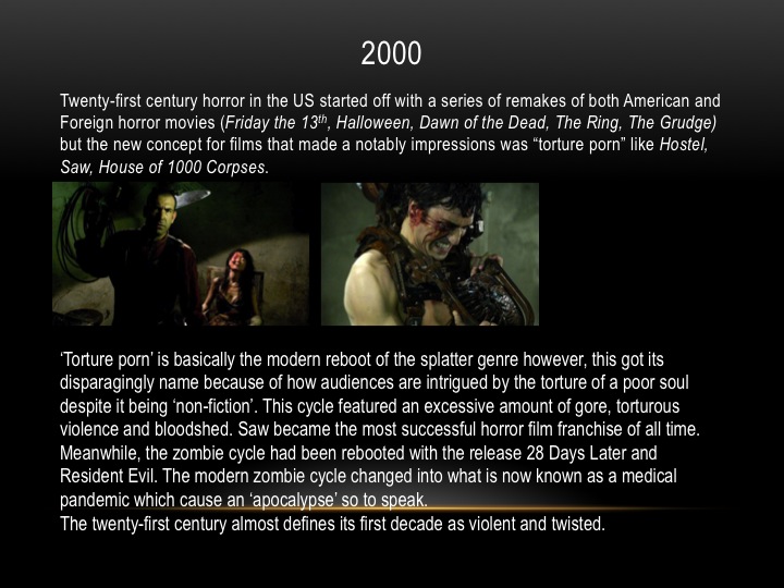
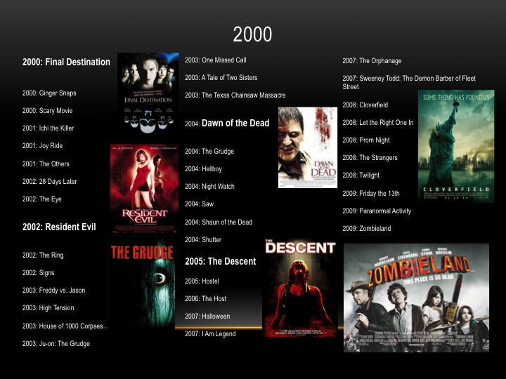
http://scratchstudios.weebly.com/film-trailers.html
Film title: My bloody Valentine (2009)
Release date: January 2009
Director: Patrick Lussier
Film Info: My Bloody Valentine 3D is a 2009 American horror film, and a remake of the 1981 slasher film of the same name. The film was directed and edited by Patrick Lussier, and stars Jensen Ackles, Jaime King and Kerr Smith
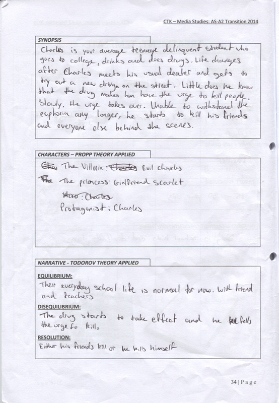
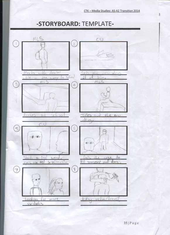
Synopsis: In the mining town of Harmony, a drilling accident is caused by the son of the owner, Tom Hanniger. The mine collapses, burying six miners alive. The rescue team finds only Harry Warden alive, but in coma, and the other miners murdered by his pickax, and they conclude that Harry killed them to save oxygen for himself. On Valentine's Day, Harry awakes from his coma in the local hospital, and he kills twenty-two people, including a group of teenagers that are partying in the mine. Harry is killed by the deputy, but the only survivors are Tom Hanniger, his girlfriend Sarah, their friend Axel Palmer and his girlfriend Irene. Ten years later, Tom returns to Harmony after the death of his father. Tom has decided to sell the Hanniger Mine, and finds that Sarah has married Axel, who is now the local sheriff, and they have a son named Noah. On Valentine's Day, Harry Warden also returns, seeking revenge against those that had escaped his pickax in the past, and Tom is accused by Axel and other locals, who in turn makes accusations against Axel.
Production/financing company: Twisted PicturesPrinciple Cast: Jensen Ackles (Tom Hanniger), Jaime King (Sarah Palmer), Kerr Smith (Axel Palmer)
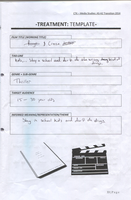
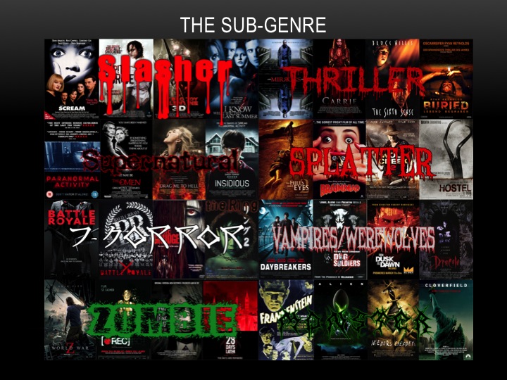
Sub-Genre: Slasher
Camera
Framing, Shots and movement: There are lots of tilting shots showing buildings this could connote that everything is calm (with the clean new looking buildings) but the fact it is titled (going diagonal) shows it is not fully perfect, that there is unsteadiness within the movie. There is a close up shot showing a victim of the antagonists’ eye. They did this to show the NVC where she looked vulnerable and cautious. There was also use of a low angle shot denoting the antagonist walking on a cagey floor. This connotes he is superior and that he is on top of the victims-could be literally and mentally. An overhead shoulder shot was used denoting the antagonist behind the victim. This connotes that he can see her but she can’t see him giving him power of surprise and the NVC of the victim was that she weak and scared. A zooming out movement was done in the beginning this makes us look like someone is walking backwards away from what’s coming from the tunnel because they are scared of what’s coming out.
Sound
It starts off with like a heartbeat effect where the sound goes steady then has a sudden ‘boom’ noise to keep the audience engaged. This represents our heart that it will be beating like that but as the video goes on it gets faster this will be due to us being scared. There is a deep voice in the background near to the end the deep voice connotes something scary-manly. A voice over with A deep voice was used to make people tremble which contrasts with a high pitch voice will sound sweet and friendly less scary. At the end also there is a gas mask sound where it feels like someone is struggling to breath (breathing heavily) This connotes that someone is panicking and using a lot of energy for example a stock situation which is running away. There was an evil laugh which is a sound effect. This connotes that the antagonist is laughing at the victims that he is superior due to them being in his territory.
Editing
There were quick shots to connote how fast everything is happening and enforcing a lot of action is there to be seen in his horror movie. It makes the audience stay off their feet because they don’t know what to expect.
Colour
Mostly dark colours were used such as dark blue, black, dark red when they were in the mining or tunnel place. These dark colours connote that they are in darkness mainly and shows the victims are in a vulnerable location also the dark red connotes blood which will show how dangerous and gobsmacking scenes are.
Mood and Styling
The trailer makes me feel I’m with the victims or in their position due to the sound of heart beats going slow to fast which connotes something scary is raising it. Also a lot of point of views was from the victims so it put me in that perspective of them and in some scenes it was pitch black which can be inferred to the victims being vulnerable.
Narrative
By watching the teaser trailer the movie looks like its fast pacing and through the quick shots it makes the audience think they are moving with the victims. Also can be moving with the antagonist. Location: mining area with cages and looks isolated till the people went down there. The fact it is a mining place
|
|
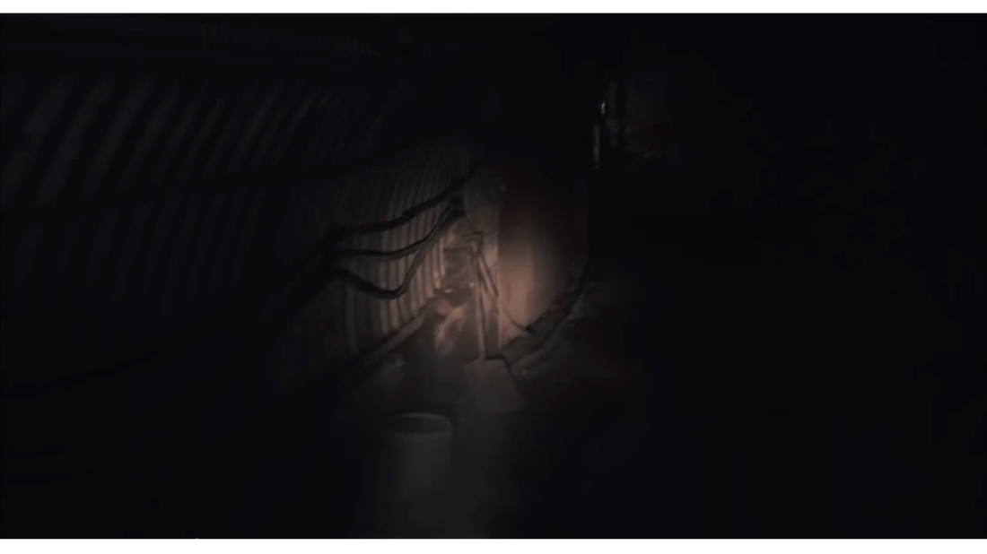
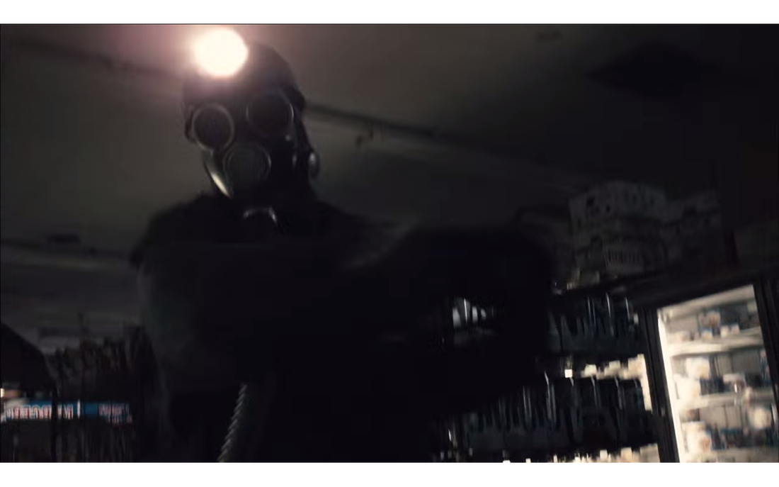
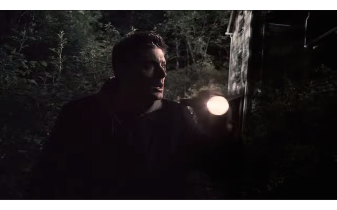
Mise-en-sceneLighting: The lighting mostly came from the torches under the tunnel this was to find the antagonist. This connotes that the victims are in the dark, clueless and frightened if they walk in the dark anything can happen.
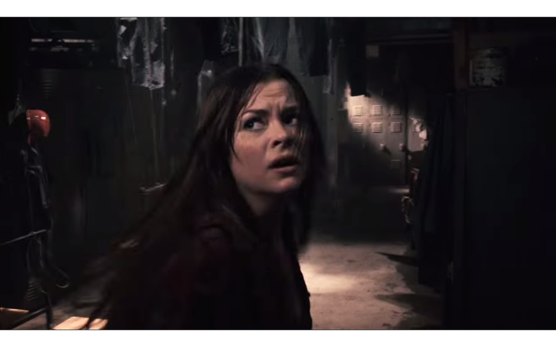
NVC: The characters NVC are sometimes showing they are trying to be aware through mid-shots they turn their heads to mainly every sound or thought of being anxious that the antagonist is around. The NVC of one lady was that her eyes looked like they were about to cry because she had fear and probably was trapped because her eyes kept looking around in fast pace. One man in the movie had a serious face showing that he could be more stronger than other characters but still he was shocked because he said ‘what is that?’.
Setting: The setting is mainly in a dark tunnel which connotes one how closured it is and that it’s hard to see or do various things to get away from the antagonist. The location makes them helpless.
Costume: The antagonist is wearing a mask and blacked out beneath connoting he’s hiding his identity.
Props: mask that looks like a gas mask which can connote how ancient the antagonist is and that he has been around for a long time in that ancient place. There is torches for them to see where they are going and can see the antagonist before he attacks so it connotes they are prepared for the worst.
|