MAGAZINE FRONT COVERS
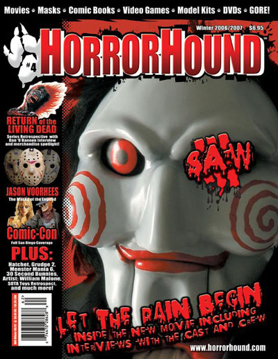
Film title: Saw III
Release date: October 2006
Director: Darren Lynn Bousman
Film Info: It’s the third part of the movie. They change the victims and scenery from each Saws also the way they harm themselves or get harmed/tortured.
Synopsis:
After eluding the cops, psychopathic killer Jigsaw turns an abandoned warehouse on the edge of town into a gruesome torture chamber in this third installment of the horror series. Jigsaw's new protégée Amanda kidnaps a doctor who's forced to keep the evil master alive. Barely clinging to life, Jigsaw begins to carry out his gruesome plans for the lady doc and another helpless victim.
Production/financing company: Twisted Pictures
Principle Cast: Tobin Bell, Shawnee Smith, Angus Macfadyen
Sub-Genre: Thriller
Magazine: Horror Hound
Mise-en-scene
Lighting: The lighting is quite dim
NVC: The character is doing a cunning smile in the main image. This connotes they are plotting something and shows they are evil. Also could show they are sadistic, you can image this character smiling at someone who is receiving pain. The smile also denotes they are happy. The eyes are staring deeply at something which can connote something has got their attention and it is interesting. Due to the eyes bulging out and being open widely can connote they are being entertained e.g. through watching someone suffer.
Setting: The settings are dark-black which connote mystery and fear. Fear because some people are scared of the dark and anything can pop out of the dark leaving the audience off guard or anxious. Also there is a red flames look around the image as a layout maybe to connote danger.
Costume: The costume you cannot really see but by looking at the character closely they are wearing something black which can connote to them blend in with the dark and trying to be hidden.
Props: A mask is used for the characters face which denotes them hiding their identity. The prop has red circles which connote hypnotise him which can bring fear to people because that means he can control them. So basically it gives off a connotation of control. The red Lipstick looks gruesome and can connote blood.
Camera: Framing and Shots
The camera shot is a close up which zooms into the facial expression of the main image which is very interesting. By doing close up can suggest that the photographer wanted more impact and intensity to be brought to the audience. Focusing on the iconic image of a character from saw who is an antagonist (villain). Due to the iconic image people are more attracted to the magazine because it is a familiar face.
Colour
There is a colour scheme of black, red and white mainly throughout the magazine. The red connotes blood mainly which is an iconic prop in horror movies. Loss of Blood leads to death and pain so this can scare people. Also Red captures attention from a far because of it’s a vibrant colour. The white can connote a ghostly feel where the audience don’t know who the person is behind the mask and it mainly dignifies mystery. Black represents darkness which suggest a spooky feel and is iconic in horror movies because anything can take advantage by the fact of us losing our senses of sight in a dark room or a dark place in general.
Typography: Anchorage, Font type
The main cover line text that looks quite inky/bloody this links to horror movies using blood and it being splattered everywhere especially in the sub-genre-splasher. The text looks unorganised and is even done diagonally to make it standout. There is a sequence it of the text going from a large font to a small font which can show the life span of people in horror movies as the blood runs out they are closer to death. In addition there is a shadow effect behind the red writing which can connote following, that an evil person or something can be following a victim e.g. in horror movies before they make their kill this is a stock situation.
Mood and Styling
The Photo makes me feel uncomfortable because of where the eyes of the main image is staring and how unordinary the colour it is normally eye balls are white but on this mask it is red which is interesting and scary. The overall magazine looks nice because of the sequence of red, black and white which is a range and work well together; also having connotations with them. A lot of black is used in the background which makes me feel that there is going to be a lot of darkness in that movie Saw 3. I like the way the typography of saw 3 is over one of the eyes because it makes sense. The word saw meaning seen something and we use our eyes to see it.
Specific conventions
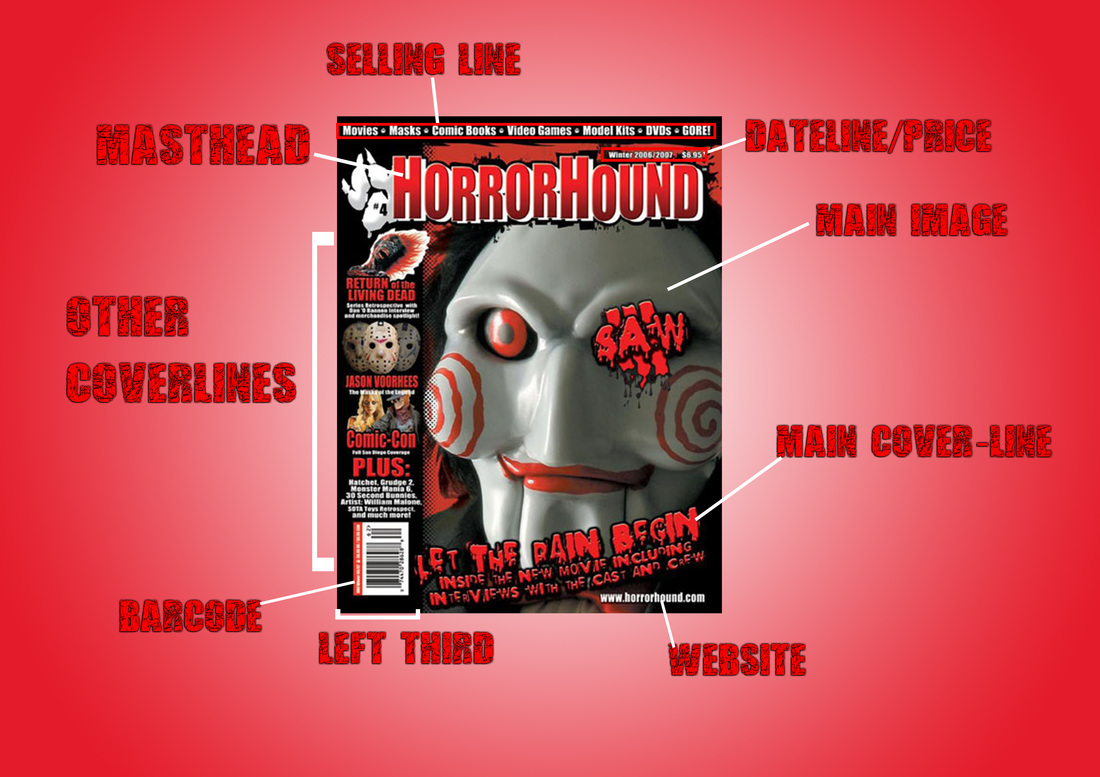
Masthead: The masthead is in a solid and sharp font. Also it looks 3D Due to the white edges. The 3D effect creates the sense of coming up to someone which links to the main image where out of the dark something gruesome can come out of nowhere to scare the audience. The text is not all in one line but it is unsteady this can connote in horror movies things go against the normal such as the way people kill or what people do to survive. The unsteadiness can also link to the audience being unsteady when watching a horror movie because they do not know what is about to happen at any time. The font is large because it is the name of the magazine so the audience can remember it if they liked reading the magazine and so that it can be seen from far away. The alliteration of the name of the masthead has an effect Horror Hound sounds spooky when being said the repetition of the ‘H’ reminds the audience it is about horror movies.
Cover lines: are in the same font and colour as the main cover line to create continuity throughout the magazine. The red colour still connotes blood, danger, alertness and many more.
Selling line: This is at the top of the page and is done in basic ‘impact’ font style and is very small. Also it is white which can connote purity to contrast with the red suggesting evil connotations. White shows the good from Good vs Evil theme which are in horror movies.
Mood and Styling: The Photo makes me feel uncomfortable because of where the eyes of the main image is staring and how unordinary the colour it is normally eye balls are white but on this mask it is red which is interesting and scary. The overall magazine looks nice because of the sequence of red, black and white which is a range and work well together. Also having connotations with them. A lot of black is used in the background which makes me feel that there is going to be a lot of darkness in that movie Saw 3. I like the way the typography of saw 3 is over one of the eyes because it makes sense. The word saw meaning seen something and we use our eyes to see it.
No comments:
Post a Comment